
Overview tab - main graphs
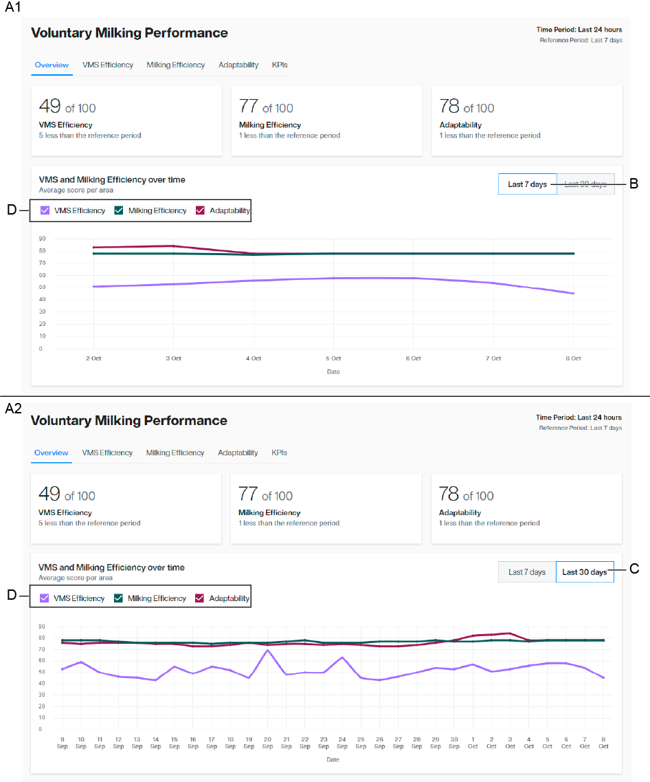
The Overview tab is the main default tab where the scores of areas are presented with the graph. You can see three scores calculated for the last 24 hours and compared with the average of the last 7 days. The scoring is from 0 to 100 points, where 100 is the highest and reflects the best result in this area. The scores are updated every hour.
In the graph, you can filter trends for the last 7 (A1) and 30 (A2) days, for single or all scores.
A1 Graphs presented in last 7-day period
A2 Graphs presented in last 30-day period
B Last 7-day filter
C Last 30-day filter
D Scores per area graphs
Main functionalities

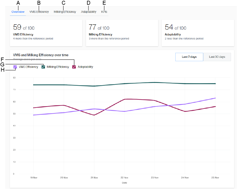
A | Overview | E | KPIs |
B | VSM efficiency tab | F | VMS efficiency graph |
C | Milking efficiency tab | G | Milking efficiency graph |
D | Adaptability tab | H | Adaptability graph |

